Direct Mail Campaign 2026 - Illustrated Teams
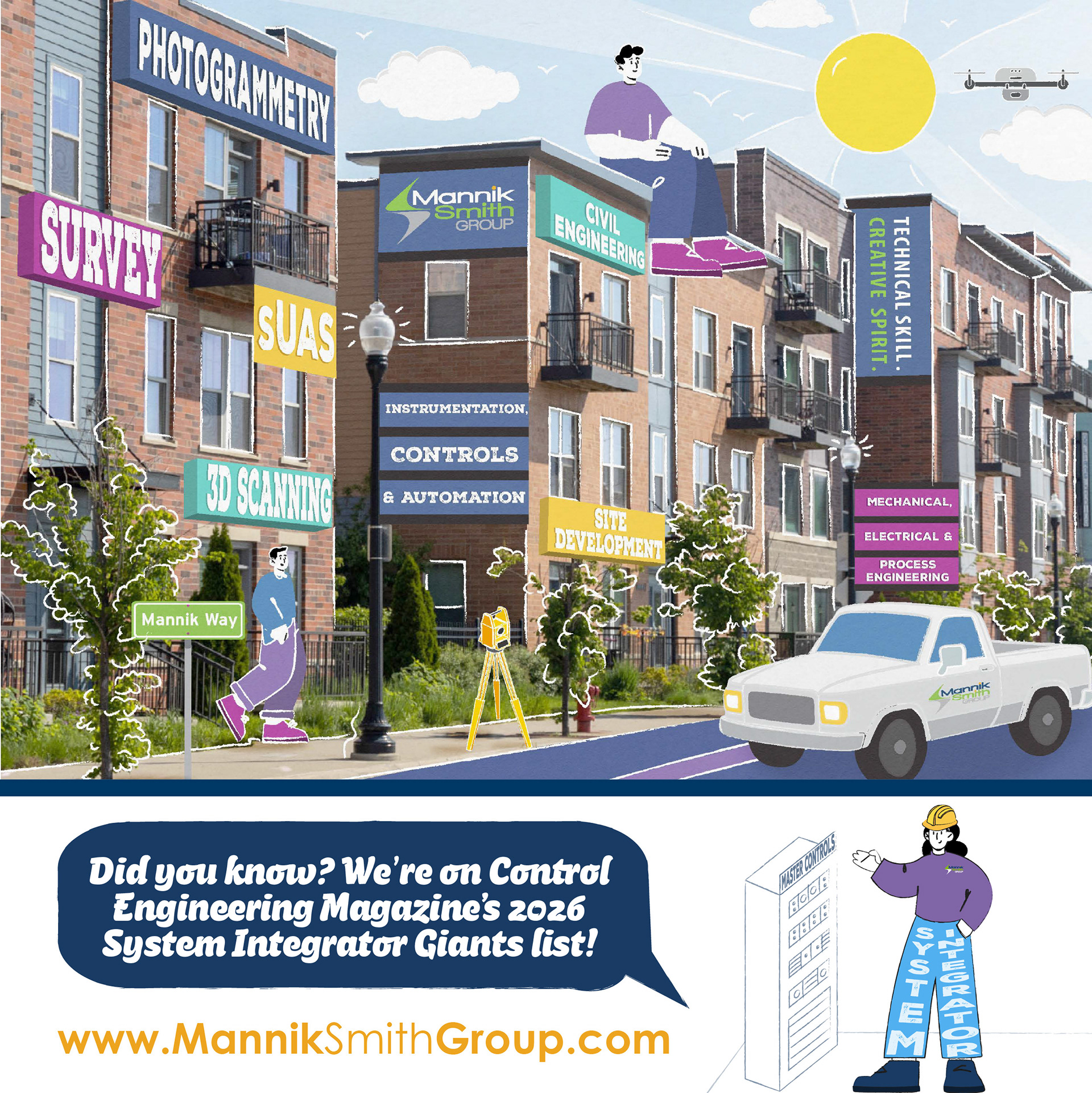
The campaign began as a team concept using seasonal clip art to highlight different company services. Since previous campaigns also relied on pre-made imagery, I saw an opportunity to create something more personal that connected the campaign to the actual work our team does. I proposed shifting the direction toward real projects from our portfolio and using a mixed-media style that combined photography with illustrated elements.


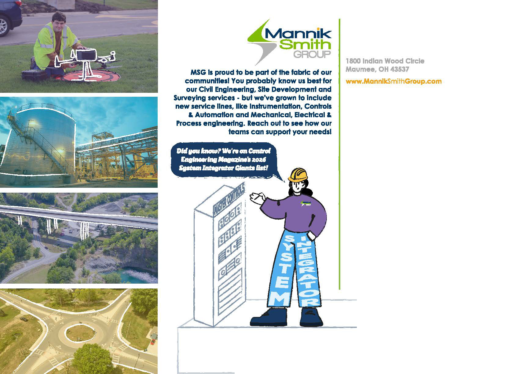
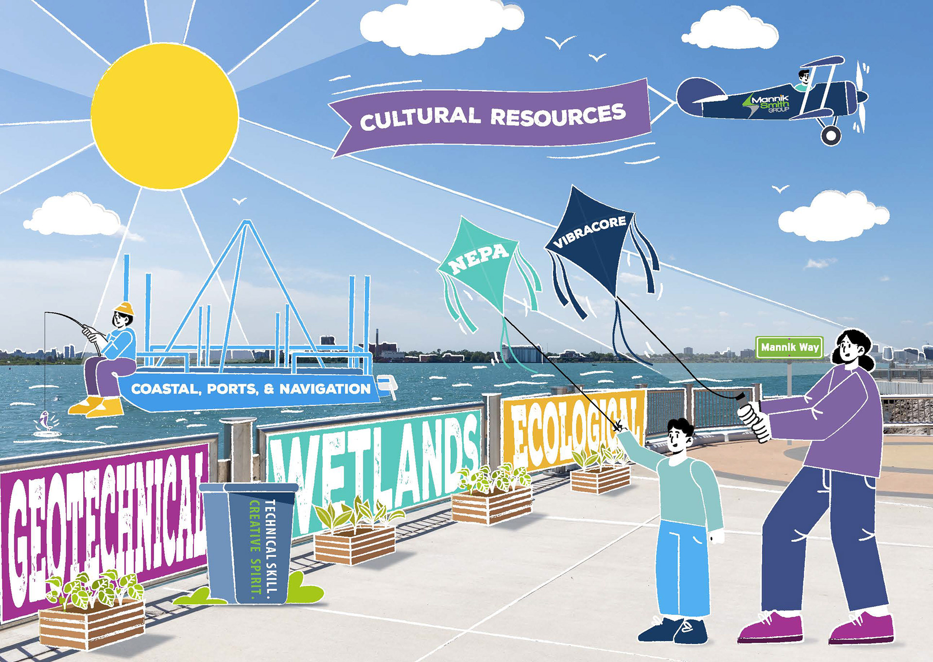

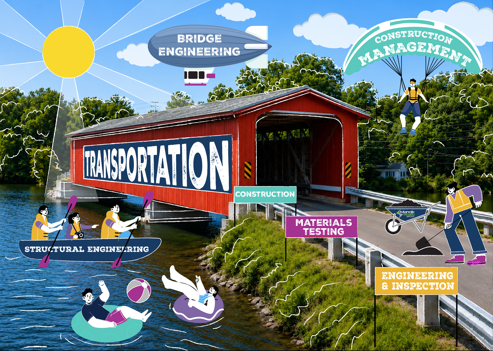

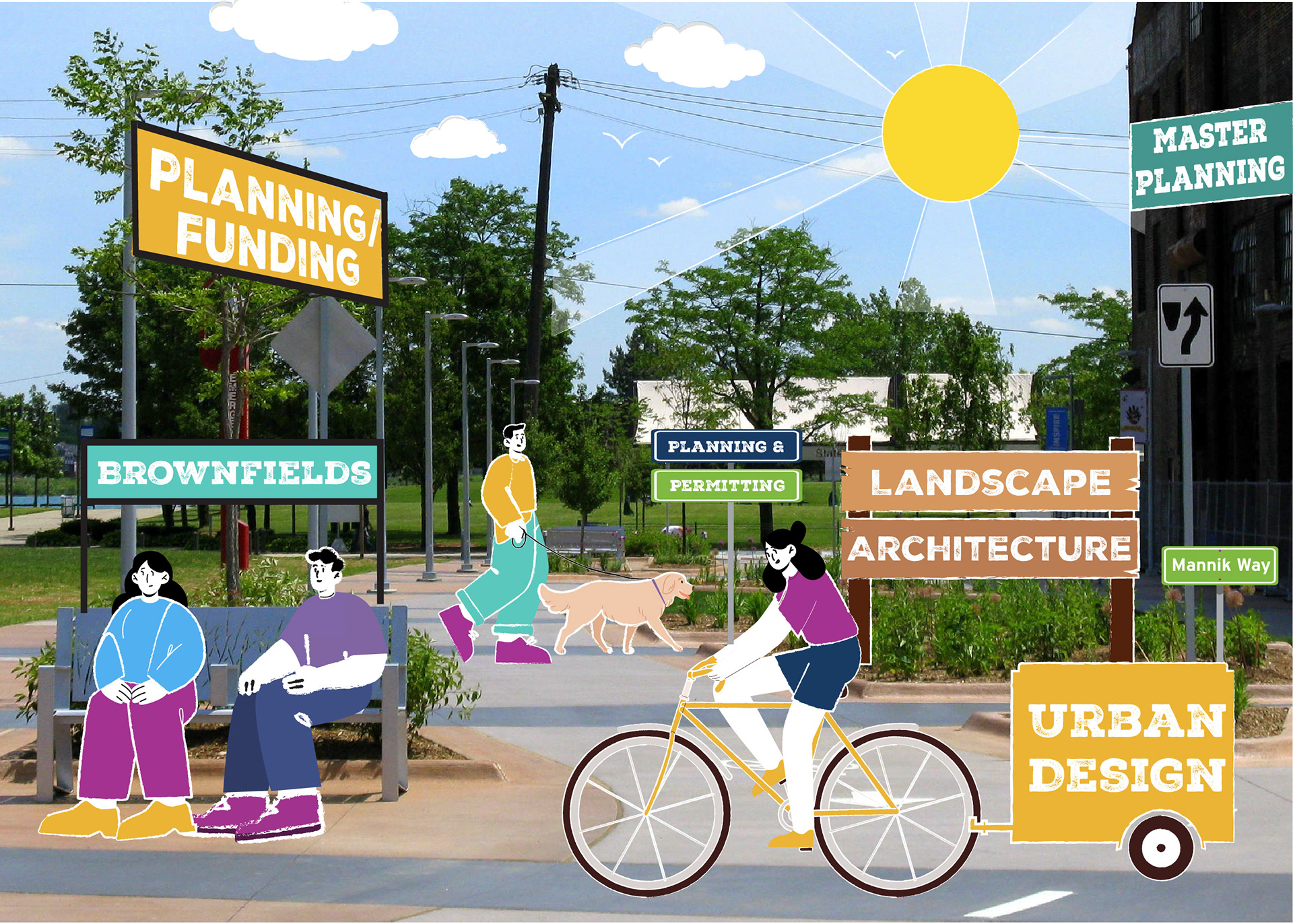

I created a moodboard and style guide to develop the visual direction and presented the concept to my team. From there, I was given full artistic direction of the campaign. I used photos from our project library and carefully selected images and angles that would allow illustrated characters and elements to interact with the environment while representing the services being highlighted.
From the initial concept to the final front and back designs, I illustrated and designed each piece of the campaign. The final direction brought our real projects into a more engaging and unexpected format while creating a consistent visual style across the campaign. The campaign was printed and mailed to a large list of current and prospective clients, putting the final cards in the hands of the people the campaign was created for.
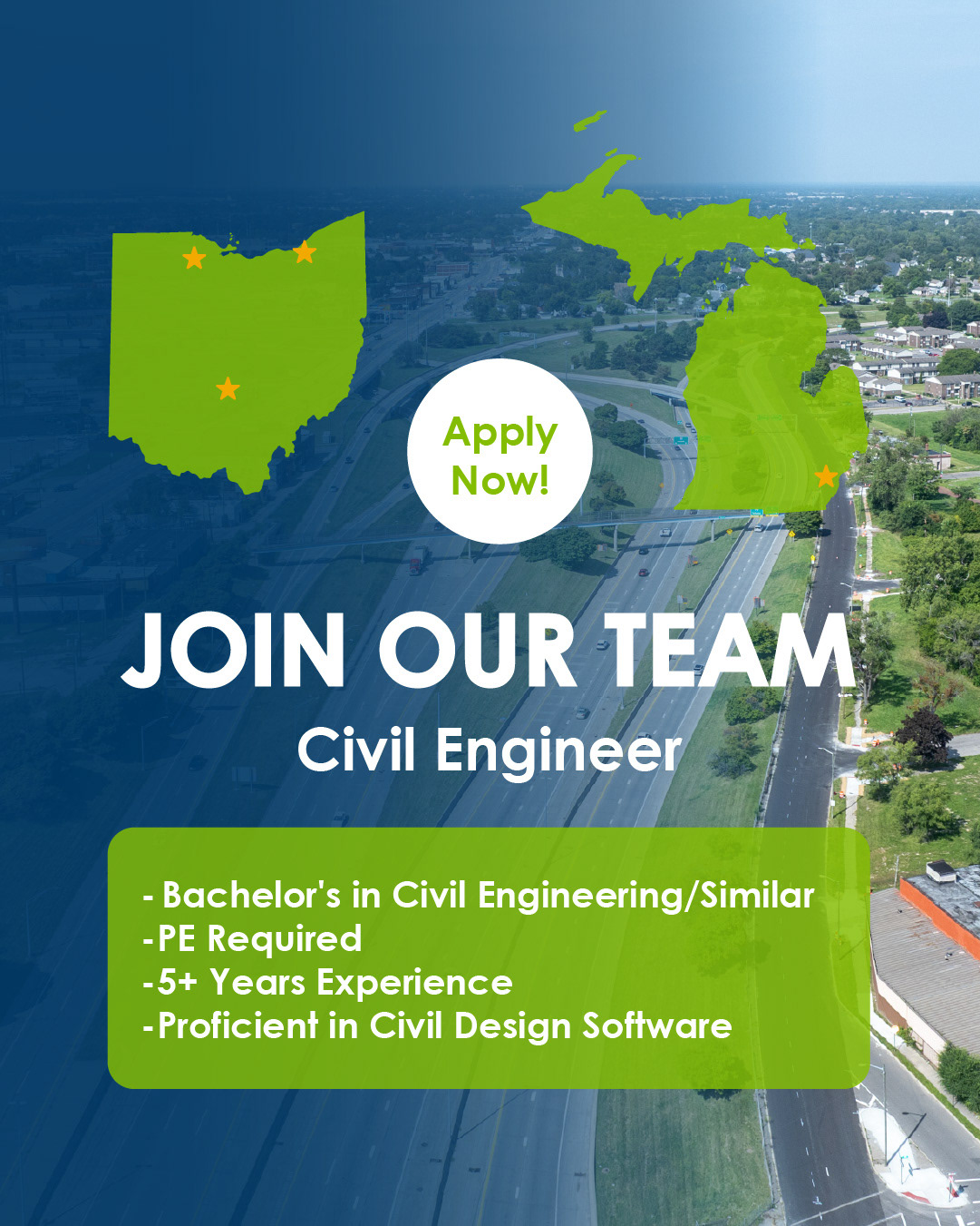
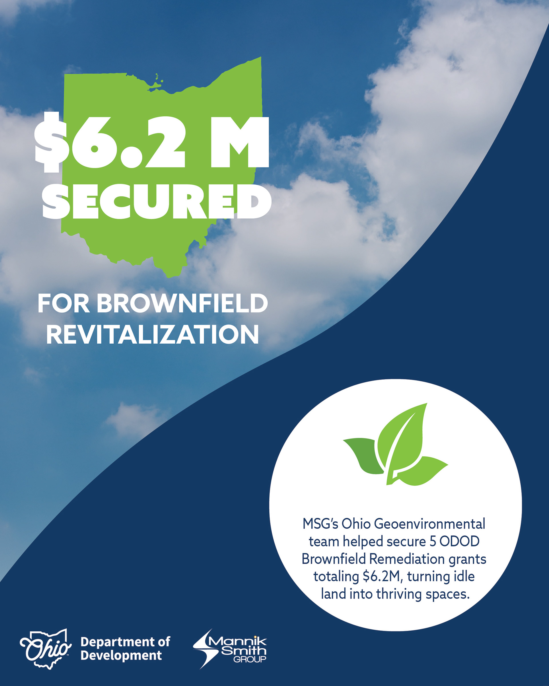
State Office Highlight Social Media Campaign
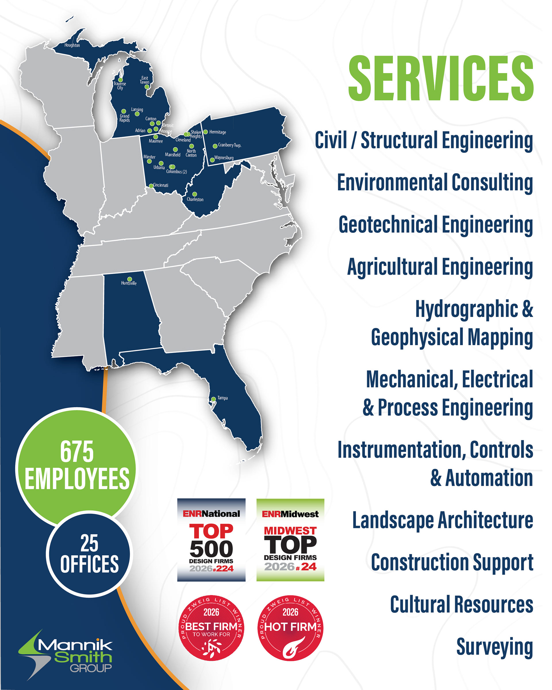
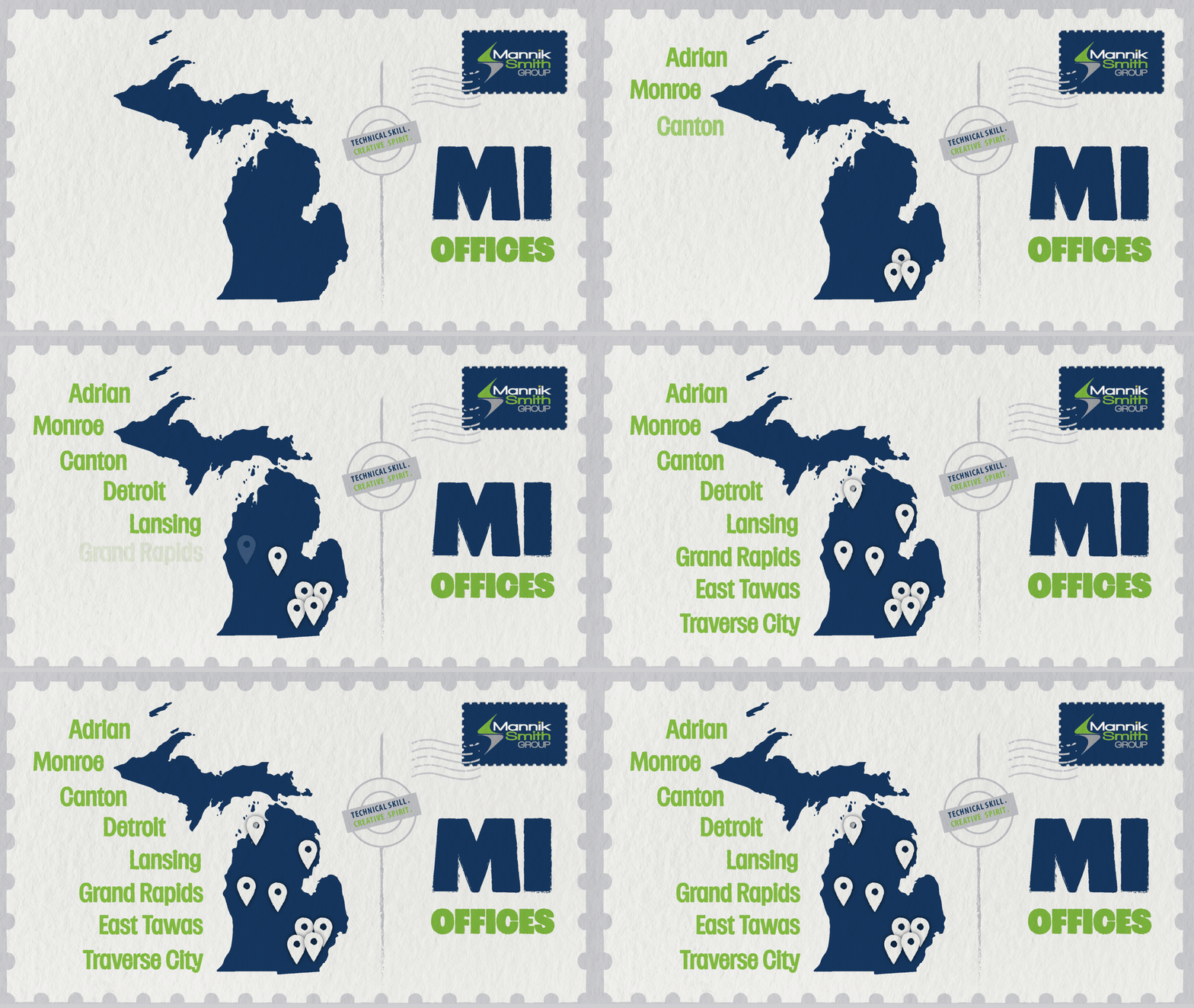
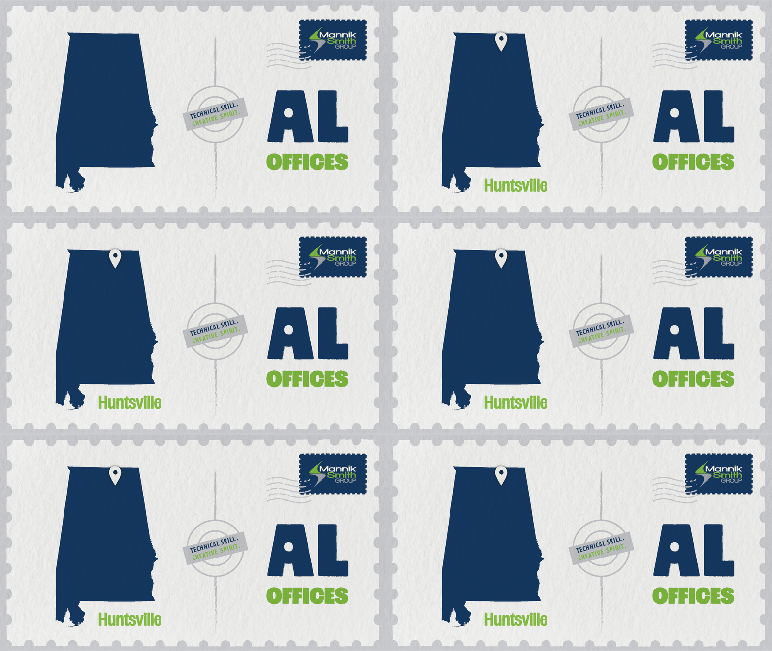
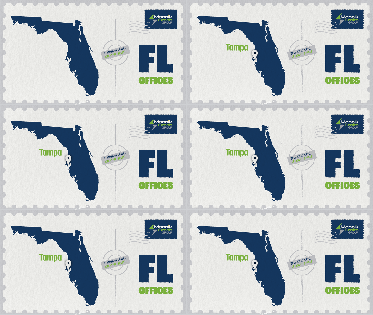
The idea for this campaign came from a conversation about how people, including some clients, did not realize how widespread the company was or how many offices we had. I wanted to highlight each location while giving smaller offices more visibility.
I kept the company’s established colors and messaging but wanted to push the visual style further. Inspired by modern postcards, I introduced a friendlier typeface and created a postcard-inspired series featuring a different state in each post. I developed the concept and visual direction, using state maps to showcase each office in a more charming and eye-catching way.
To make the series more engaging, I added animation with pins dropping onto each office location. The resulting GIFs were also adapted for internal and external email campaigns, creating reusable assets that could extend beyond the original social media series.


Coastal Ports & Navigation - Custom Icons

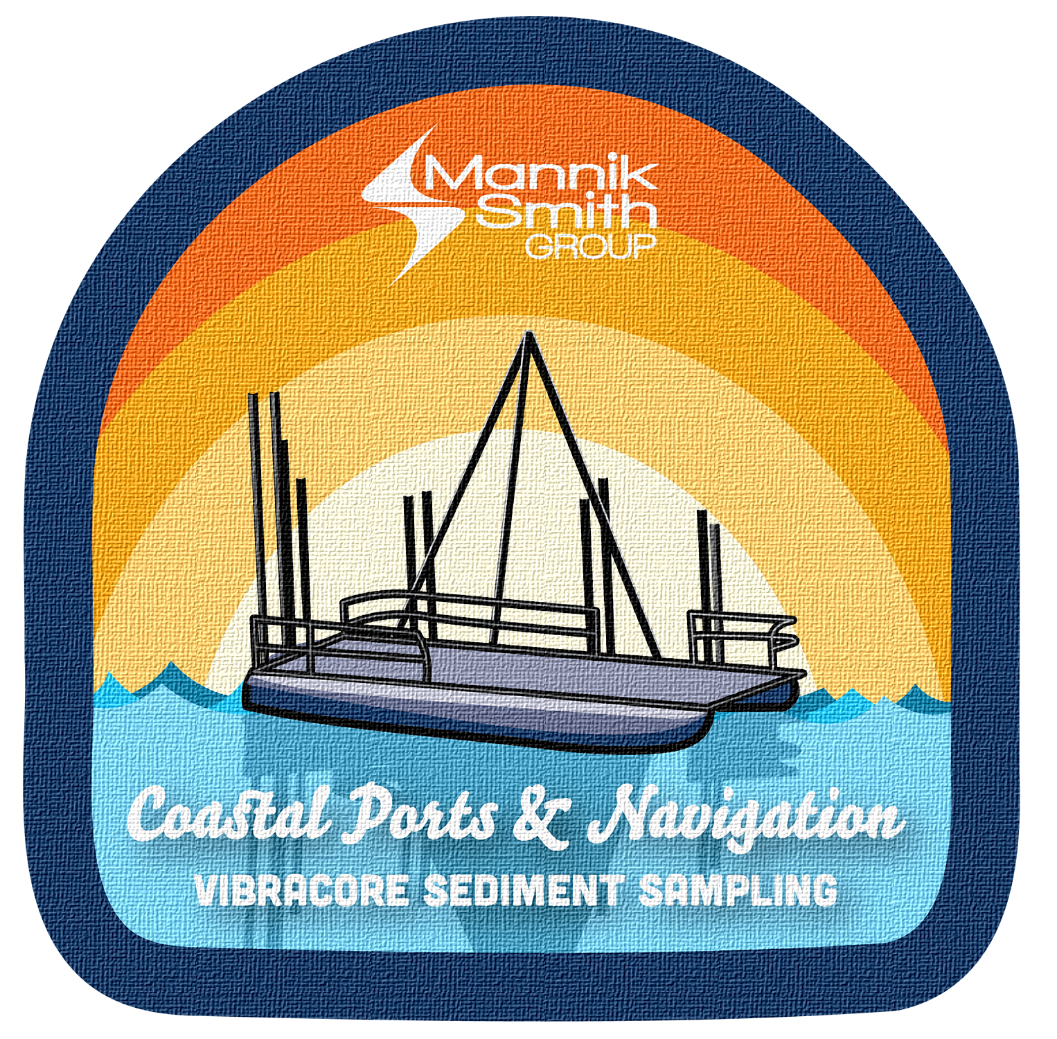
With several service departments across the company, the Coastal Ports & Navigation team approached the marketing team looking for a way to better communicate what they do to both internal teams and potential clients. Their initial idea was to create a set of icons to represent their services.
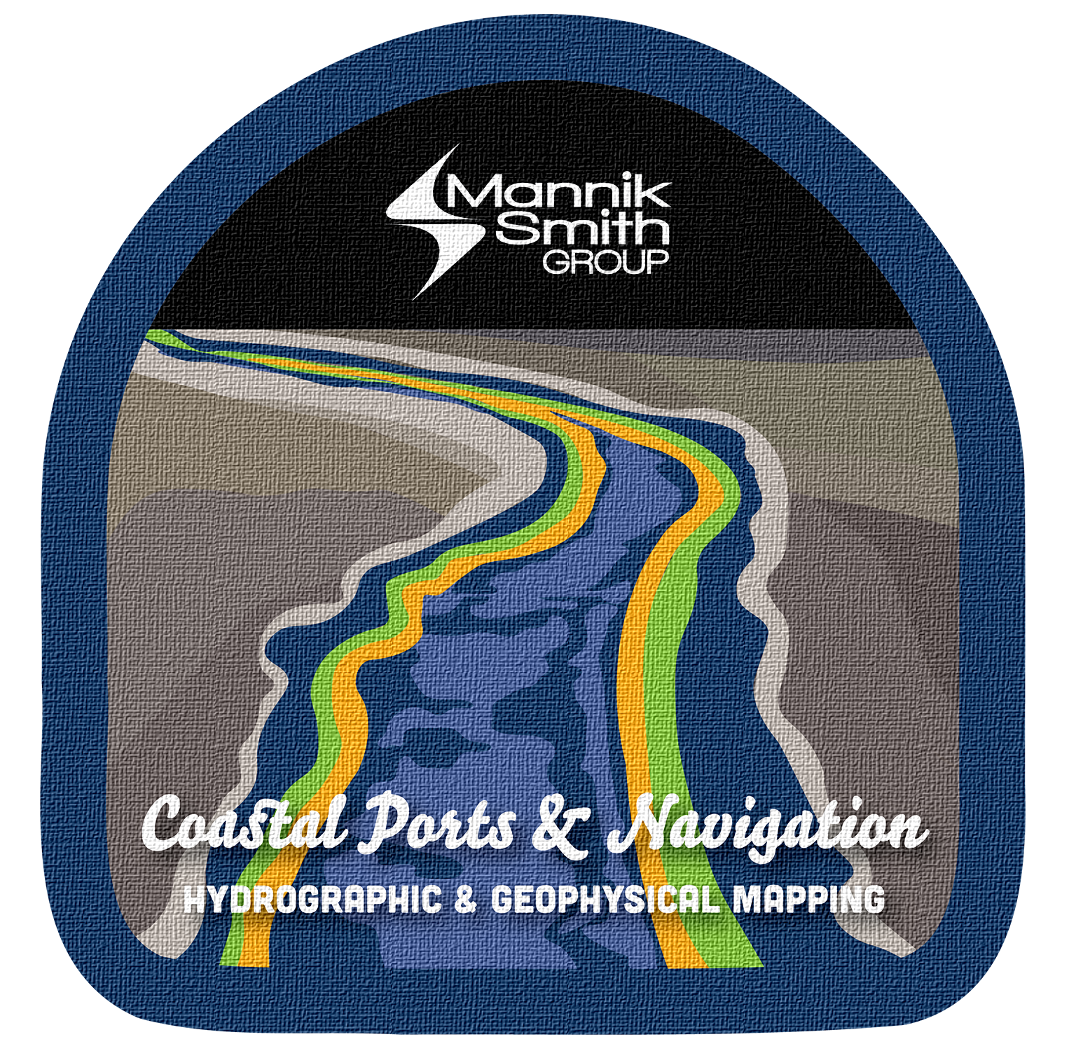
Since much of the team’s work takes place outdoors and on the water, I took the concept in a more visual direction and developed a vintage park patch-inspired theme. I looked to the colors, shapes, and illustrations found in vintage national and state park patches for inspiration, choosing a color palette that complemented the company’s brand while bringing in a more natural, outdoors-focused feel.
I created three illustrated icons that could work as stickers, apparel, hats, and other team materials. The icon system then grew into social media templates that could be used to highlight individual services, as well as a printed card the team could hand out to prospective clients. What started as a simple request for icons became a flexible visual system that could be used acrossp

Parks Master Plans - Print Materials
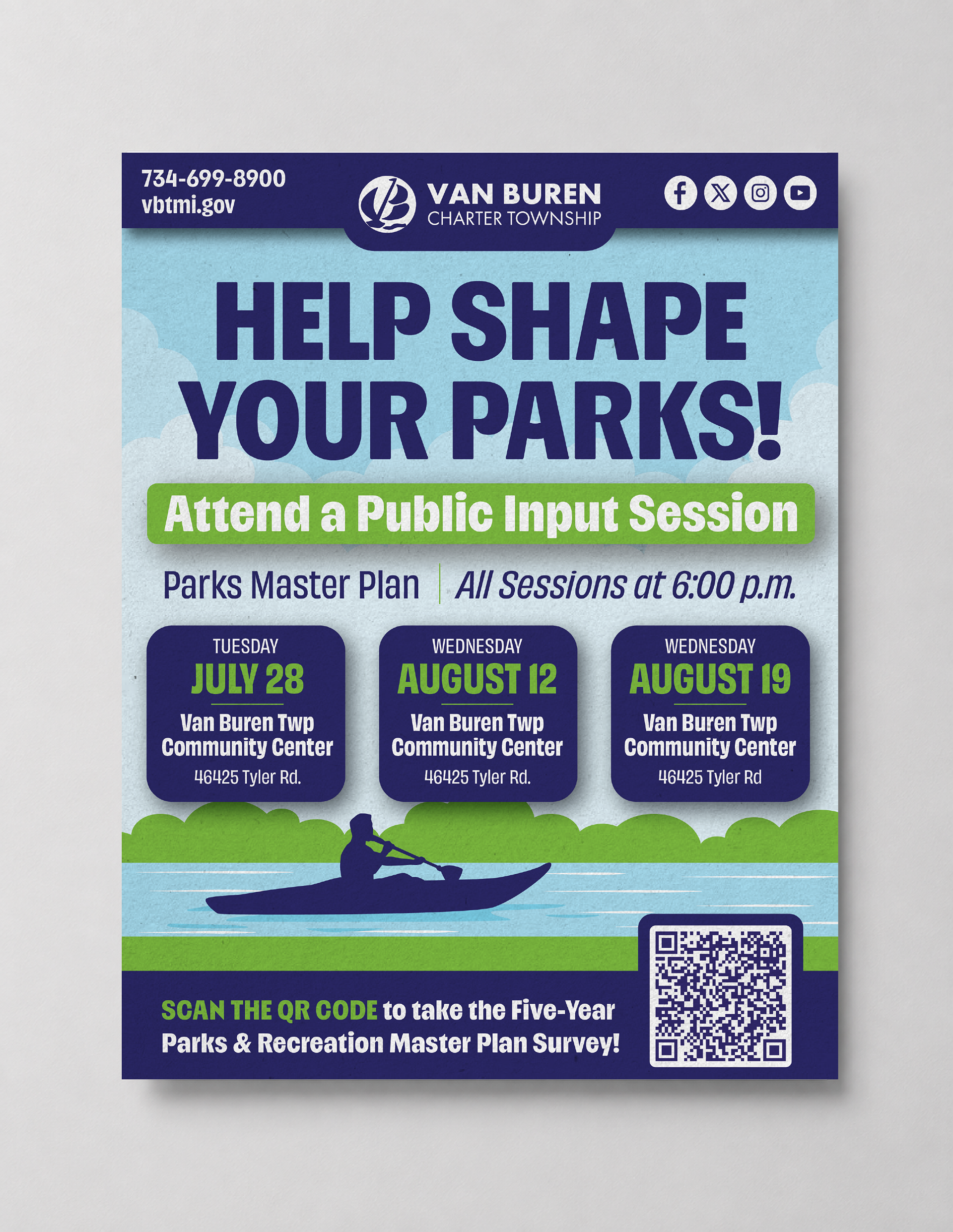


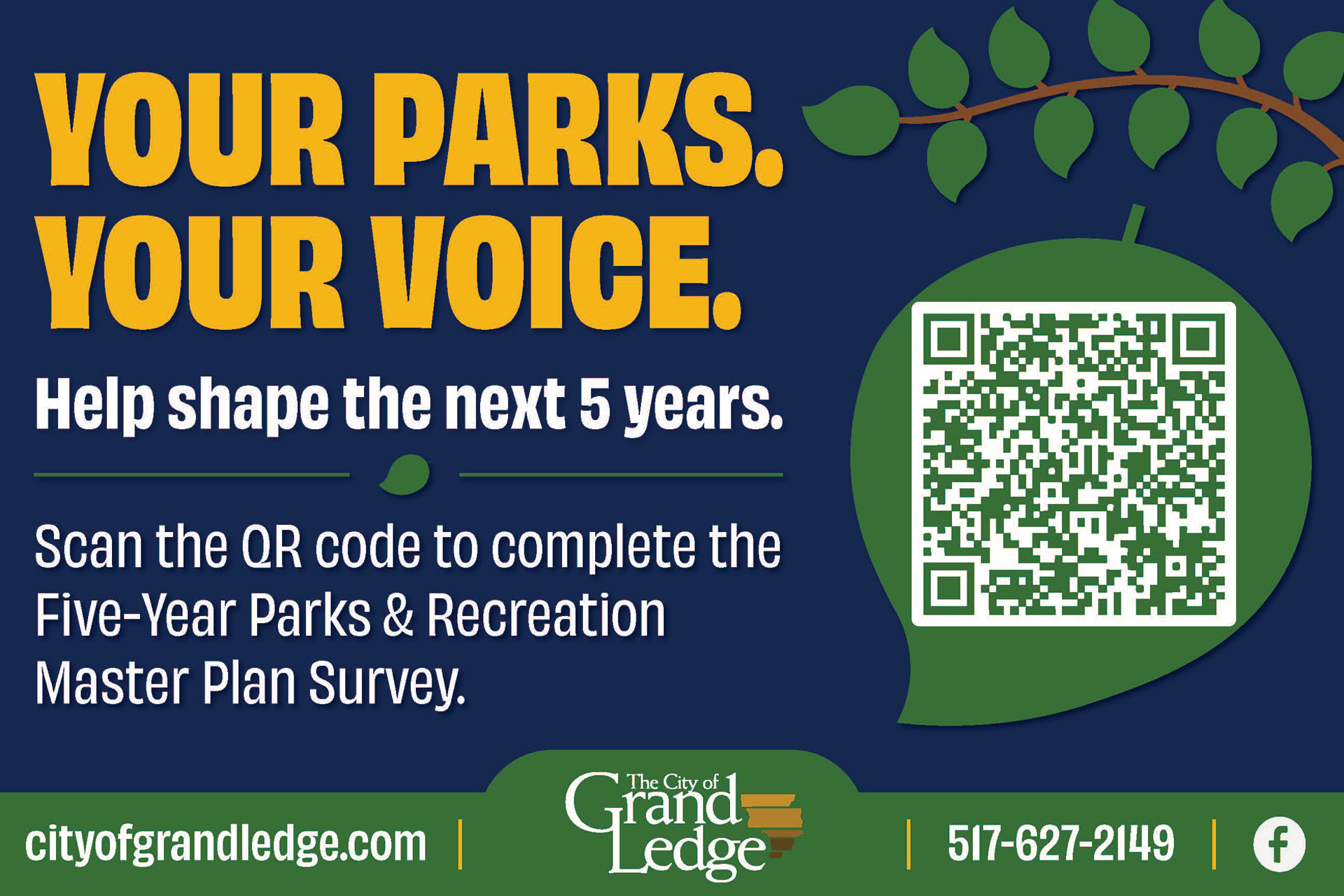
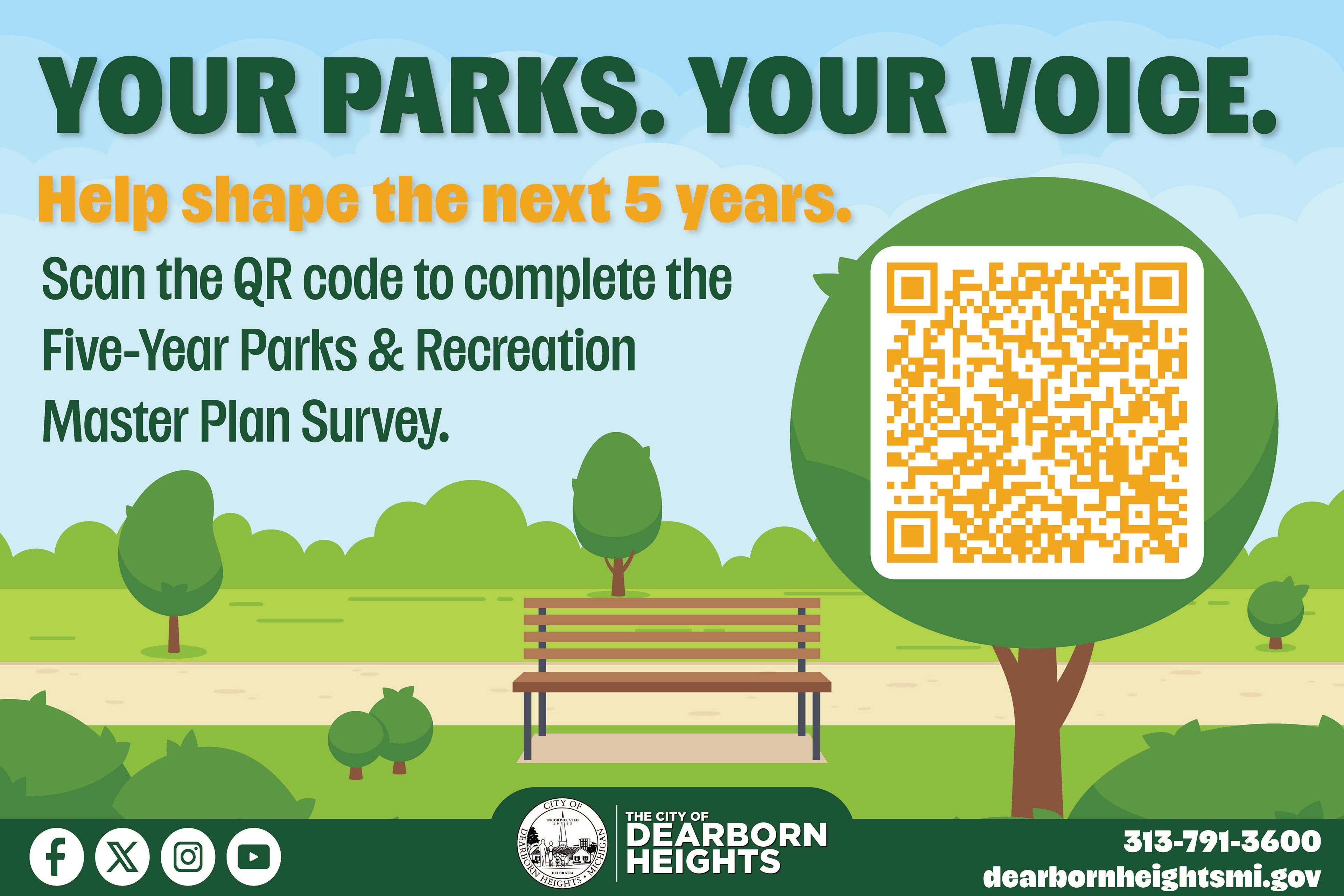

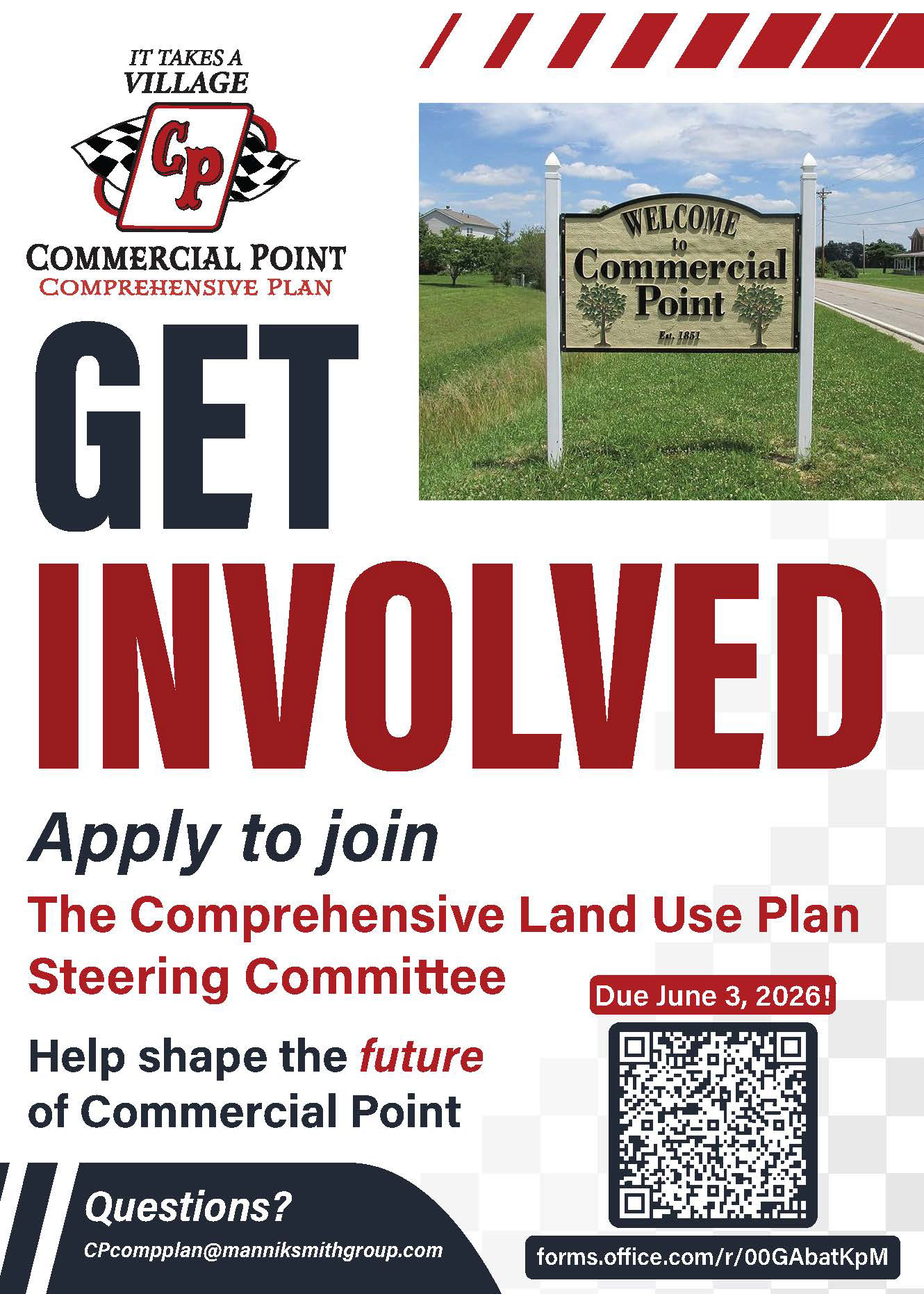
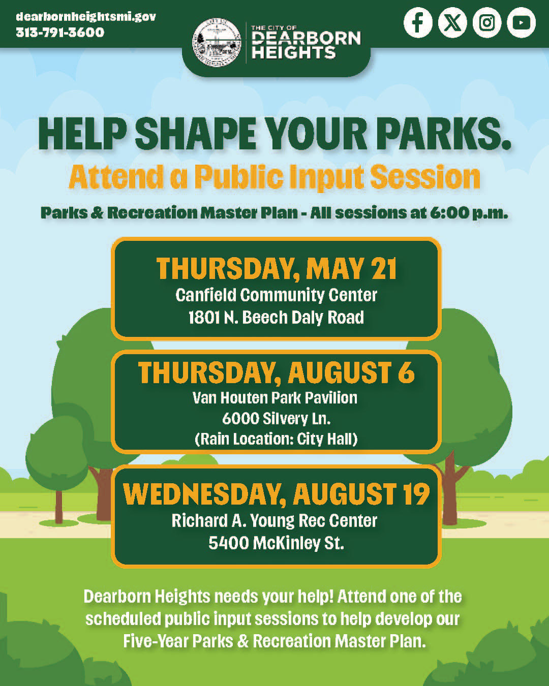
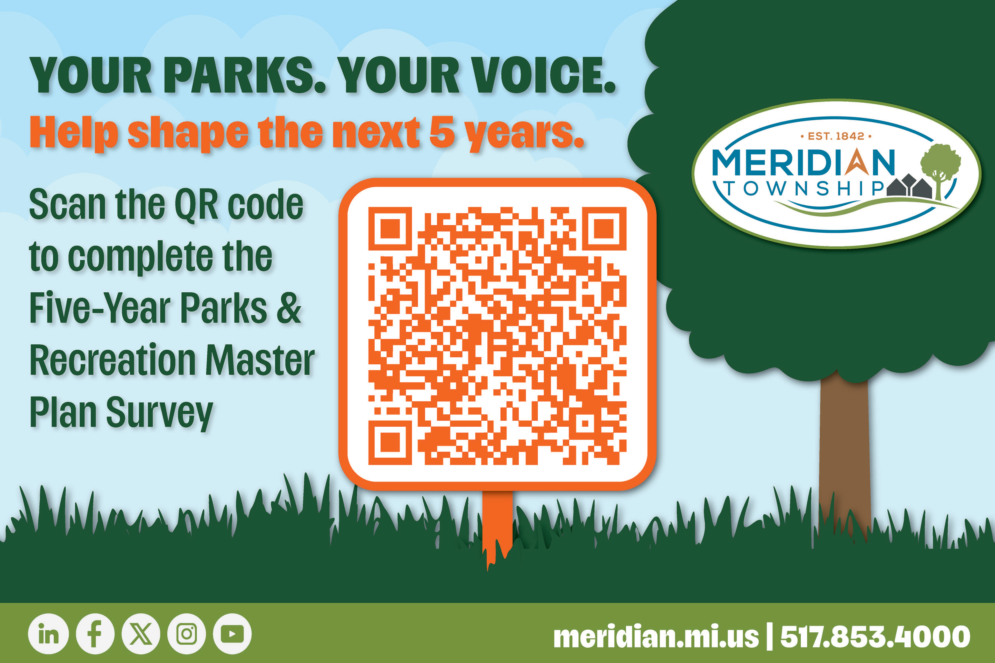
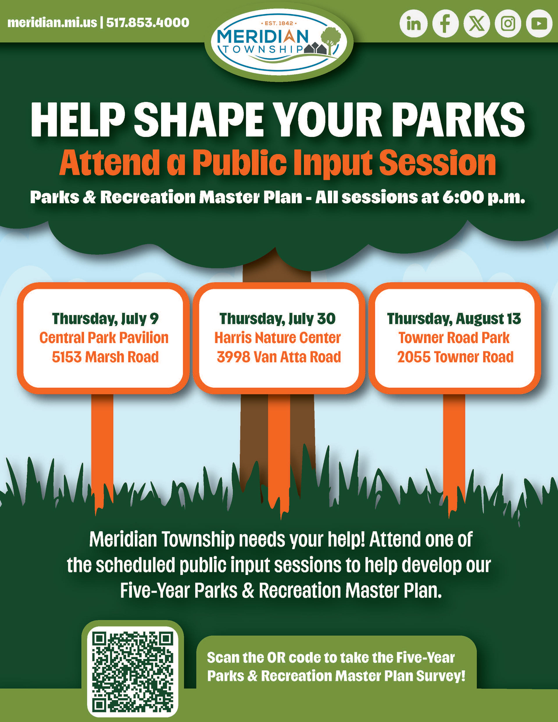
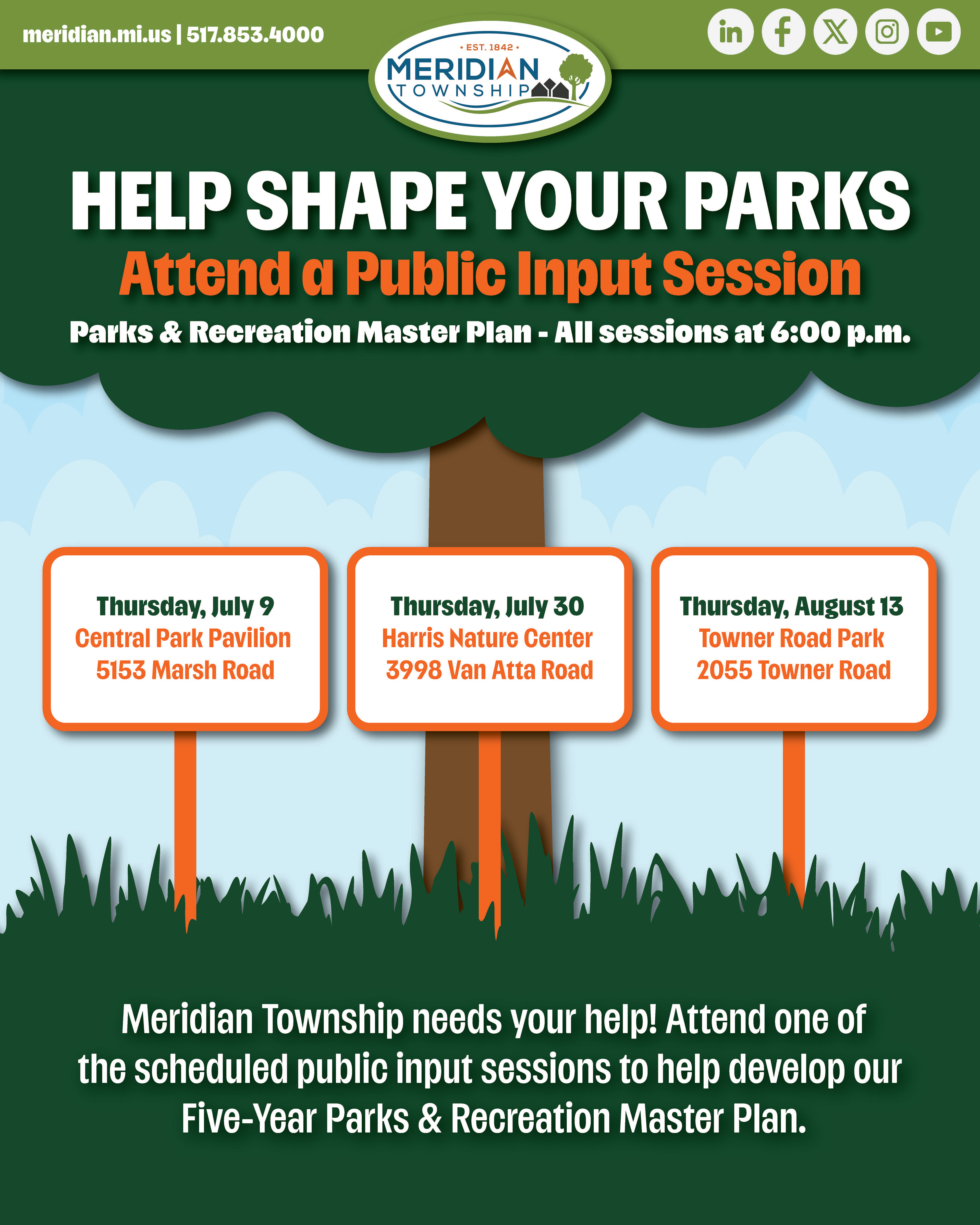
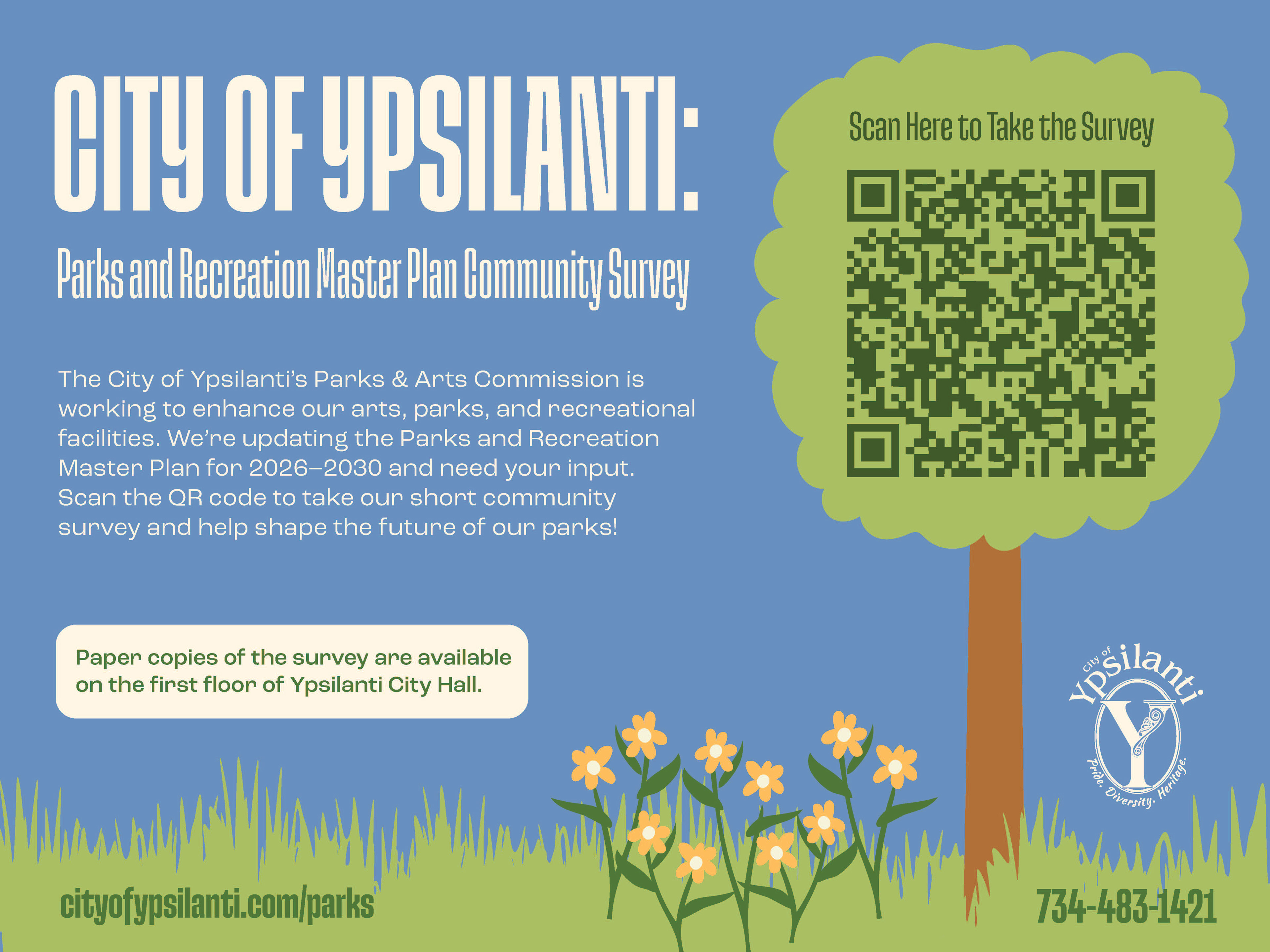
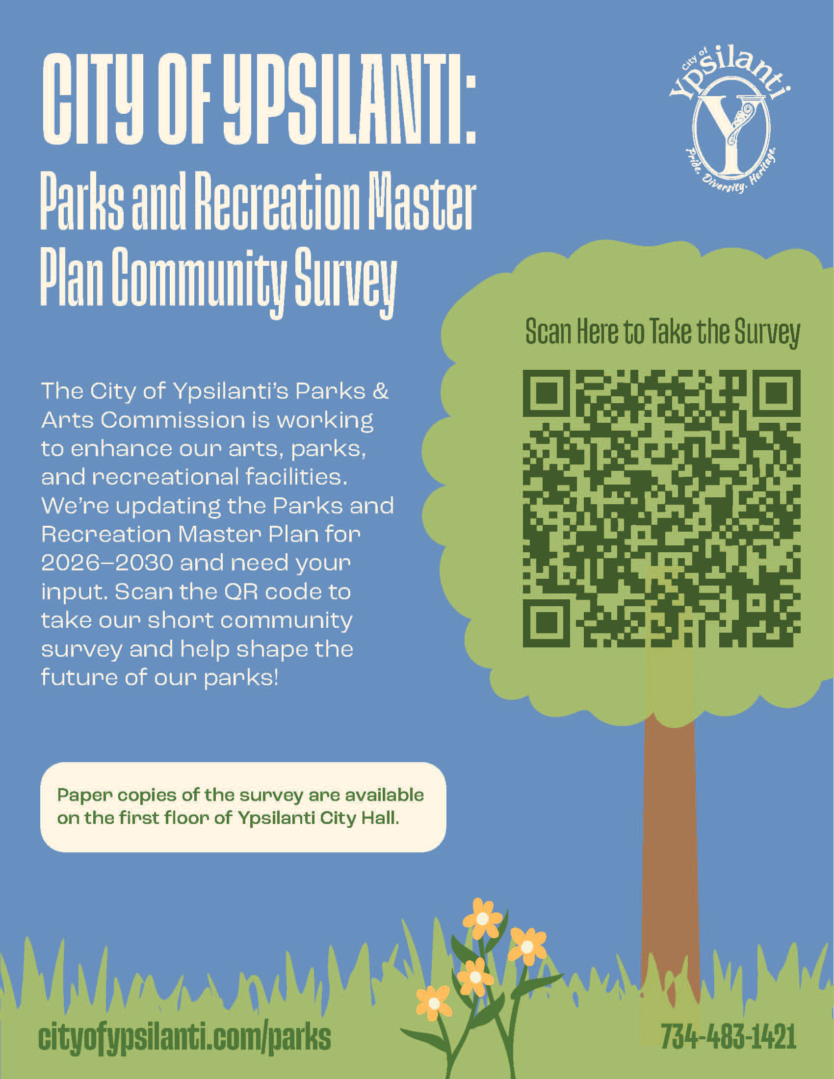
The Landscape Architecture and Parks Master Planning team reached out to me to create print and digital materials for the parks and recreation projects they were developing with cities and other community clients. With only a few guidelines to follow, such as incorporating the park’s logo and required messaging, I had a lot of creative freedom to develop the visual direction for each project.
I created materials that brought each park’s identity to life while keeping the information clear and approachable for the community. I aligned each design with any existing branding the park had while creating a visual style that fit the individual project. The designs were shared with the parks and teams for feedback and refined as needed. Along with the print and digital materials, I also designed large public input boards for community engagement sessions and layouts for printed surveys.
Working across multiple parks allowed me to create unique visual directions for each project while adapting designs to meet the needs of both the client and their community.
Informational Handouts
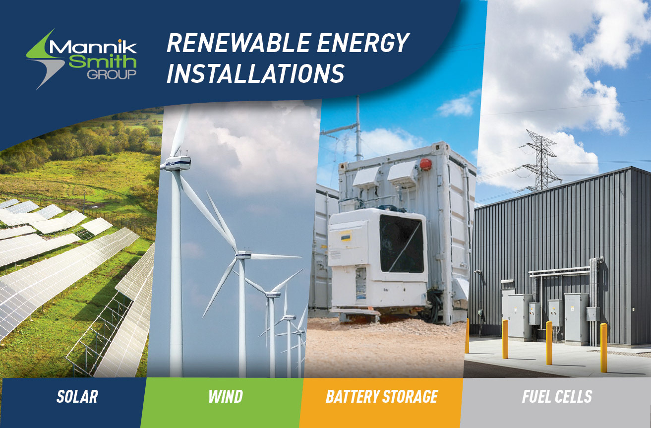
Social Media Gallery